Creation of the visual identity of Kuupanda.
Branding
Art Direction
Kuupanda
Kuupanda is an accounting and management software that makes farmers’ daily lives easier. Its goal is to save time and free up mental burden for producers who market their products themselves.
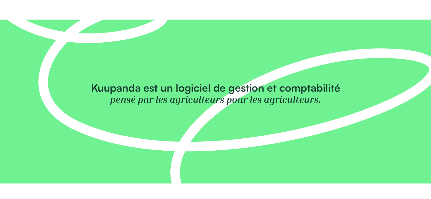
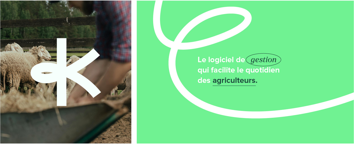
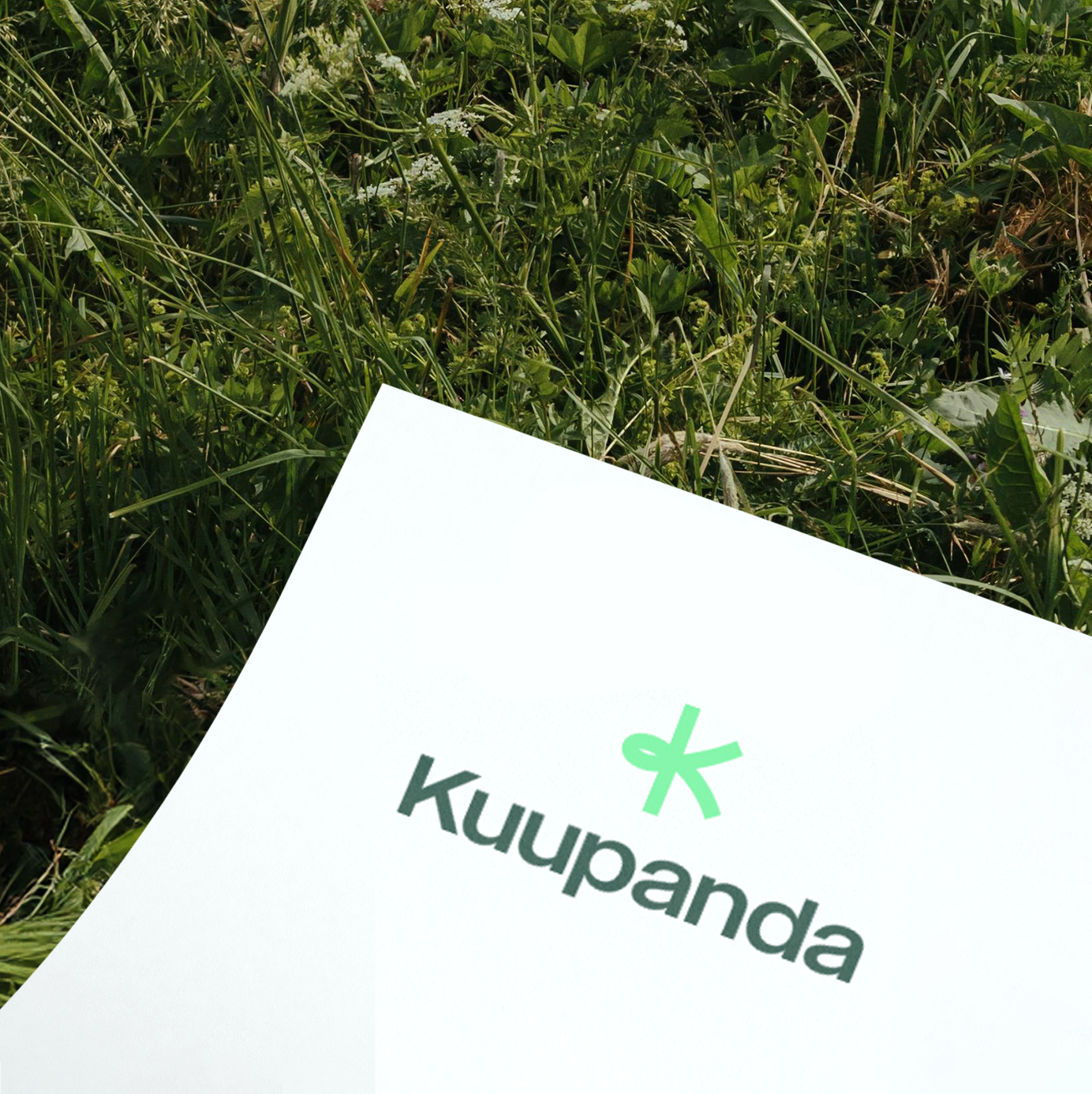
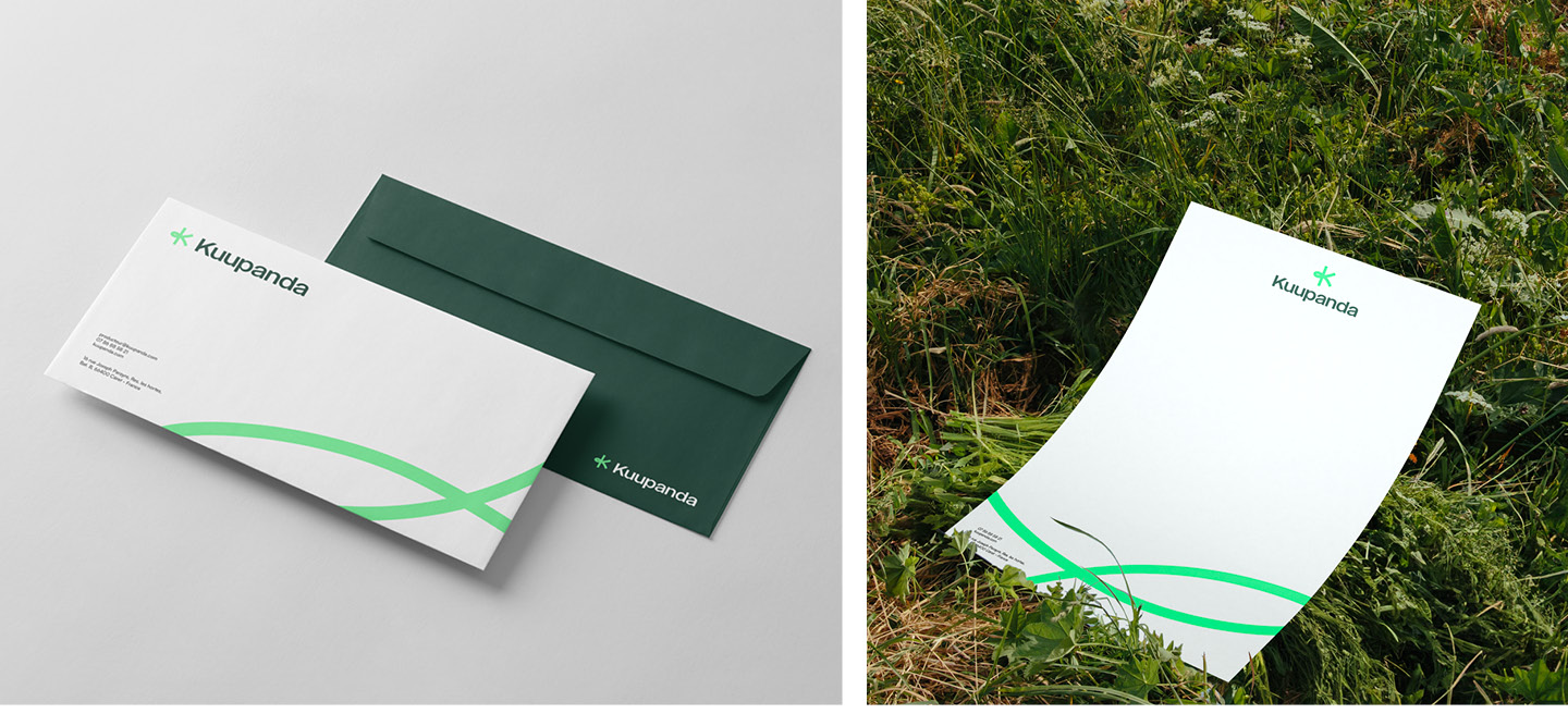
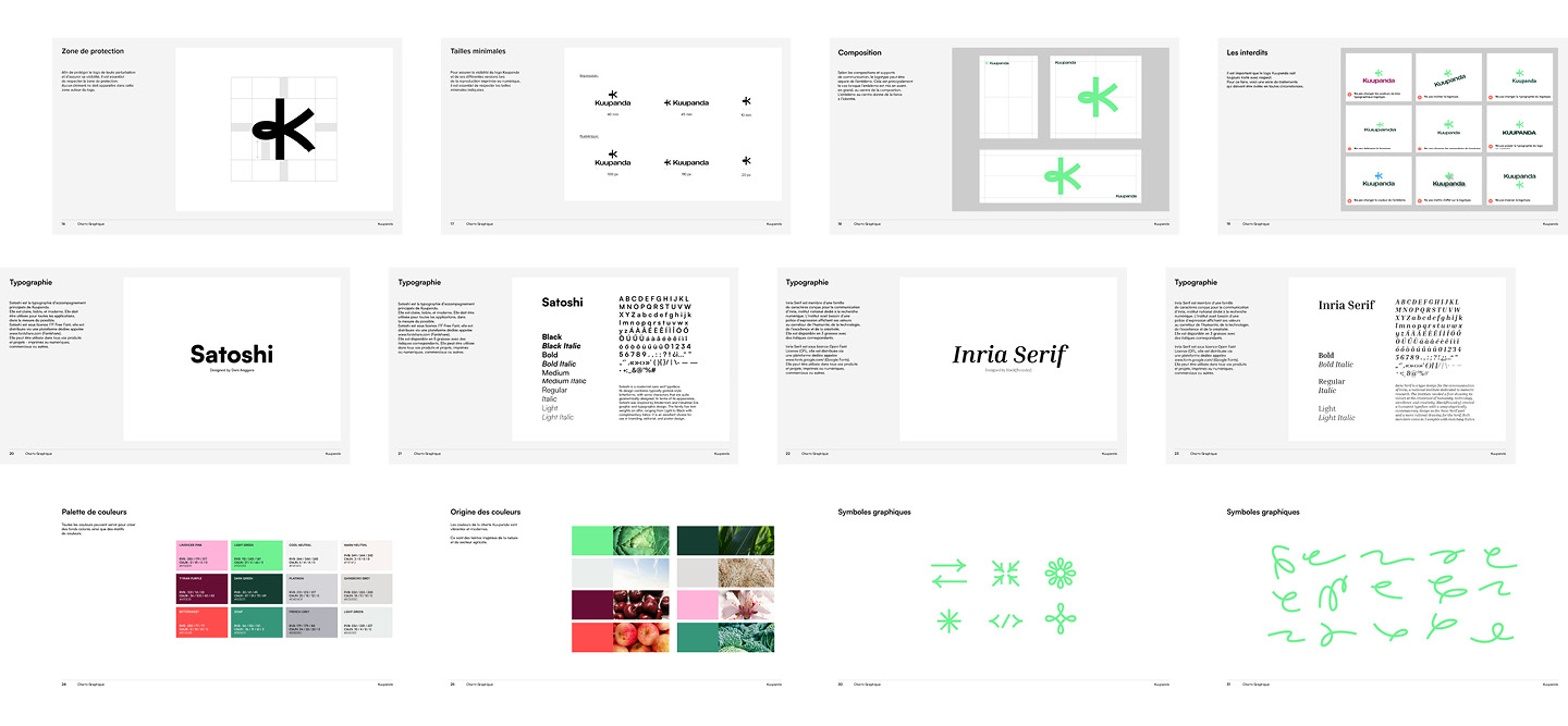
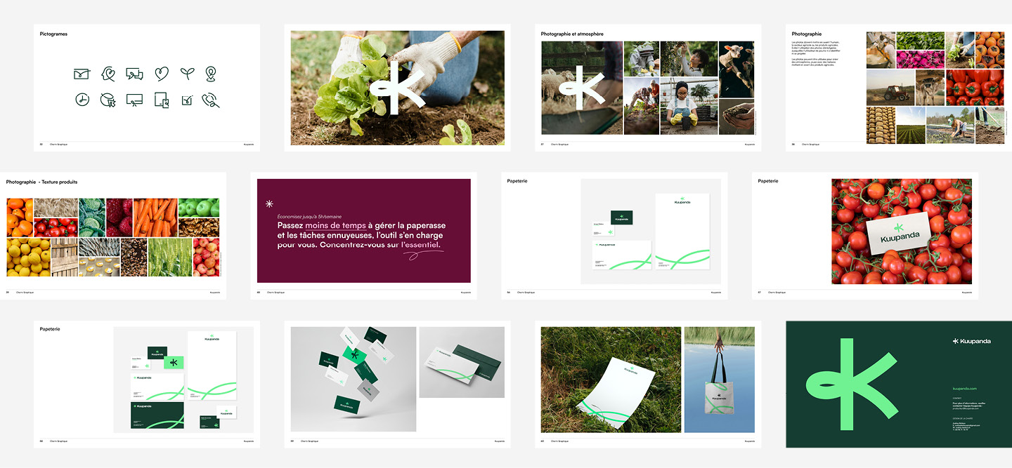
Kuupanda’s new visual identity represents the brand’s commitment to farmers, combining values of authenticity and dynamism. It aims to be resolutely anchored in the agricultural sector, while adopting a contemporary, accessible, innovative approach, which also knows how to “break the codes” traditional to the agricultural environment.
Kuupanda
Creation of the visual identity of Kuupanda.
Kuupanda is an accounting and management software that makes farmers’ daily lives easier. Its goal is to save time and free up mental burden for producers who market their products themselves.
Kuupanda’s new visual identity represents the brand’s commitment to farmers, combining values of authenticity and dynamism. It aims to be resolutely anchored in the agricultural sector, while adopting a contemporary, accessible, innovative approach,
which also knows how to “break the codes” traditional to the agricultural environment.

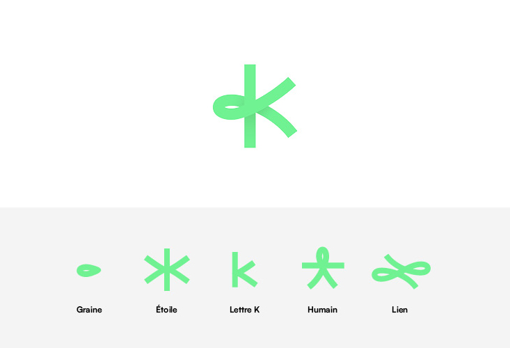
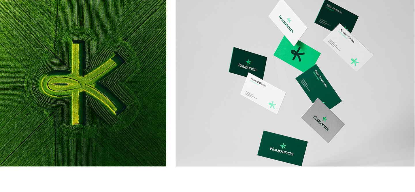
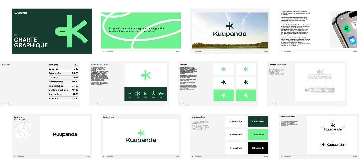
The emblem represents the letter “K”.
It also symbolizes a star, a guidance, a point of reference to orient just like the tool that guides farmers. It is a symbol of excellence and optimization. We can also see the human, who is the center of the software, the idea of a link or even the seed. Kuupanda means seed in Swahili.
The seed is an agricultural symbol and is at the origin of the name Kuupanda.
The emblem therefore represents growth, guidance, the agricultural world, the human dimension, and interconnection.










Art Director & Designer:
Audrey Boiteux
Year: 2024


